Logo Color Palette Basics & Best Practices

When business owners think about logo color palette basics, they may think, “They’re just colors. What’s the big deal?”
But the choice of the color palette for your logo affects the psychology of your brand, resonance with prospects and customers, and the functionality (or non-functionality) of your marketing assets.
Guidelines for Logo Color Palette Basics
When you’re developing a corporate color palette, the first place it will manifest is your logo.
After that, the corporate color palette will manifest in all your marketing assets including:
- Business cards
- Signage
- Sales collateral
- Website…and more.
For each of these marketing assets, there will be specific functional needs.
Business Cards need colors that can be used to visually “pop” critically important contact information that’s in smaller-sized fonts. As a result, colors need to be bold enough and dark enough to read phone numbers & emails in font sizes of 10-12 points.
Signage needs colors that allow company names & phone numbers to be easily read in bright sunlight, and at night.
Sales Collateral needs appealing colors that are visually striking and allow headlines & subheads to be easily read. For example, specific shades of yellow are a problem because it’s hard to read yellow text in bright sunlight.
Websites need a color palette that’s appealing to your target audience, and again, allows headlines, subheads, text, and buttons to be easily read, in standard lighting and in low-light situations.
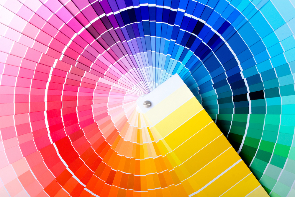
The Power of Three: Why You Need to Have 3 Colors For Your Corporate Color Palette
There’s one key reason why you need 3 colors in your corporate color palette: your website.
When you develop a website design, the specific use of colors will be programmed into the back end of the website. As part of specifying the system of how color is used consistently on your website, you’ll need to specify a different color for each of the following elements:
- H1 Header – The main big headline on each website page
- H2 Header – The subhead
- Call-to-Action Button – The button that site visitors will click or tap to take action
By consistently using a color system on your website, your site visitors will be able to “digest” your website content more easily, and more easily find the button to take action, by looking for a specific color.
Since the largest proportion of people process information visually, the use of color can be a helpful guidepost in directing site visitors through your website content.
The Psychology of Color Will Affect Your Logo & Branding
Various shades of color also have a psychological perception tied to them. A color consulting company called ColorCom has been conducting surveys worldwide about how people characterize the personality of various colors. The Global Color Survey is still in play, and you can participate by taking the survey yourself!
The results of the original color survey found that people worldwide associated certain personality traits with certain colors. Here are some examples:
- Black = Mourning, or Elegance
- White = Purity
- Yellow = Happy
- Apple Green = Healthy
- Puke Green = Illness
- Purple = Offbeat, Eccentric, or Royal
- Blue = Honesty & Integrity (Ever heard the phrase “True Blue?”)
When you are choosing colors for your logo and corporate color palette, choose the colors based on the following:
1) Can letters or numbers depicted in the specific color be easily read in bright sunlight, low-light environments, and at night?
2) Can letters or numbers depicted in the specific color be easily read from a distance (for exterior building signage), and signage at trade shows, i.e., can your signage be seen and read from across the room?
3) Will the colors be pleasing to your target audience?
How Color Codes Work
There are 2 main systems of color codes, one for printing and one for use in digital applications like websites, digital files, etc.
PMS Color Codes: This stands for Pantone Matching System, and PMS color codes are used in printing.
Hex Color Codes: A Hex Value code identifies a specific color that would be used on a website. “Hex” refers to three-byte hexadecimal numbers (meaning they have six digits). Each byte, or pair of letters in the Hex code, signify the color’s intensity in red, green, and blue, respectively. The code bytes range from 00 (lowest) to ff (the highest).
One logical question is: How does a printing color code get switched for digital uses? The answer is simple. There are online tools for color code conversion.
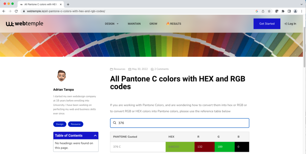
If you need to convert a PMS color code for digital use, you just Google “PMS to Hex Color Code Converter.” Once you’ve found a PMS to Hex color conversion tool, you plug in the PMS code, and the tool will tell you what the digital color code would be (the Hex color code). A word of warning however: some of the online PMS to Hex color conversion tools are complicated to use, and are loaded with ads. One of the easiest to use is: www.webtemple.io.
Here’s an example of how this works. Let’s say one of the colors in your 3-color palette is PMS 376 – a beautiful leaf green. By using a color conversion tool, you just plug in the Pantone color (PMS) into the information field. The tool will generate the corresponding Hex color code in the field just to the right. The hex color codes will be 6 digits long, and a combination of numbers and letters. If you look at the sample screenshot below, you can see that the Hex Color Code for PMS Color 376 is: 84BD00.
The bottom line is that there’s a lot more to picking a logo & corporate color palette than you might think. It’s got to have form and function.
Apply these logo color palette basics when you’re selecting colors for your logo & website, and you’re on the road to a high-functioning logo & website that both looks good and is legible to your prospects & customers.
Need help developing a logo & corporate color palette? Contact DeWinter Marketing & PR for help!