DeWinter Marketing Rant: Logo Design Best Practices That Should Have Been Used, and Weren’t

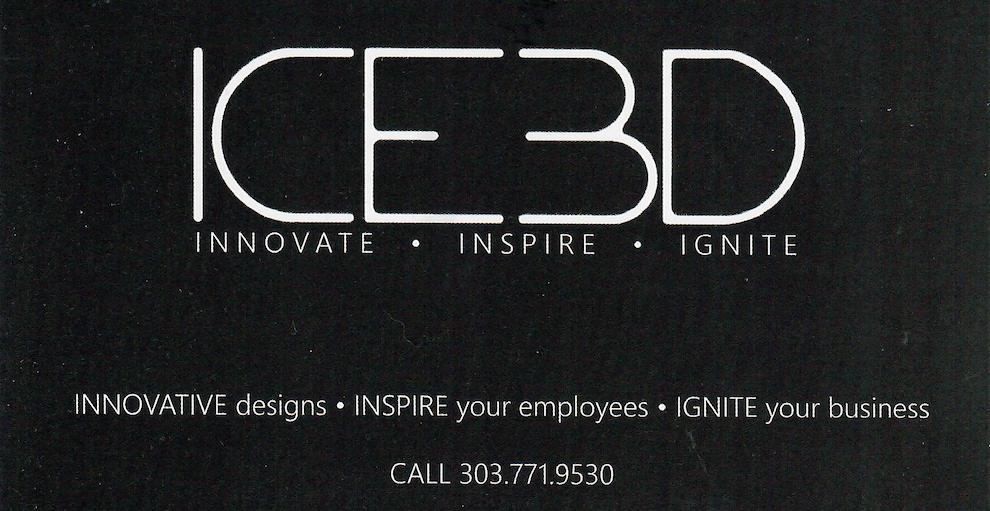
In this Marketing Rant, I’m focusing on Logo Design Best Practices, because of a recent experience. A company decided to pitch us, and sent a postcard with nothing more than a black background, their logo & a tagline. The logo was so poorly designed that we literally could not discern that name of the company, let alone the product or service that they offered.
In reviewing this postcard, it was clear that they did not follow logo design best practices, to the detriment of the company and the campaign.
Logo Design Best Practices 1: A logo should clearly convey the company name
In the case of this postcard, the typeface they chose rendered it difficult to even discern the company’s formal name. Given the highly stylized, decorative typeface, we guessed that the company name was either: ICEBD (again, a moniker that means nothing) or ICE3D (another worthless moniker that means nothing and conveys nothing).
Some folks would say that making a prospect work to understand your company name gets their attention. We respectfully disagree. In this day and age, thanks to our fast-moving society and technology, people have the attention spans of a flea. If you make someone work to understand the basics like your company name, your prospect will tune out.
The Solution: The logo design best practice that should have been followed was to choose a typeface that can only be read one way and clearly conveys the actual name of the company.
Logo Design Best Practices 2: A logo should convey what you do
The logo on this postcard was so focused on “form” & being artsy that they failed on the function part. Not only can you not discern the name of the company, the decorative, minimalist typeface conveys nothing about the company’s product or service. Given that there’s no graphic element accompanying the type, there are no visual cues to prompt prospects as to what this company does for a living.
The Solution: Add a graphic element, illustration, or simple graphic symbol that helps convey your general industry area, product, or service.
Examples:
- Writer = a quill pen symbol
- Office Designer = a schematic of a room design
- Chemist = a glass laboratory beaker
- Construction = hammer & nails…and so on.
Logo Design Best Practices 3: A tag line should clearly convey what you do
The tag line associated with this logo followed a classic tag line strategy of pairing 3 words associated with your company’s attributes, and using them in a series of 3 words separated by bullets or periods. The 3 tag line words in this logo are: Innovate * Inspire * Ignite. The problem with this approach is that this company STILL has not conveyed who they are or what they do.
The Solution: If your company has huge name recognition (Coca-Cola, Amazon, etc.), then you can get away with fuzzy, whimsical tag lines. If you’re a small to mid-sized company and prospects don’t know you, then the tag line should clearly convey what you do.
Examples:
- Writer = On-time Copy That SELLS
- Office Designer = Office Design That Inspires
- Chemist = Fast, Affordable Artificial Flavor Development
- Construction = Building Homes That Last
Logo Design Best Practices: Summary
Logo design best practices incorporate these three elements into the logo:
- Type treatment of the company name
- Graphic element
- Tagline
Common sense dictates that, if you want to attract the right prospects, you need to clearly convey the company name, use a visual element to add some “pop” and to provide a visual cue of what you do, and a descriptive tagline that also conveys what you do.
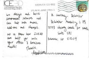 On the back of the postcard, they used a hand-written style of type that ran into the postal code information at the bottom. This also is a problem because you compromise the ability of the postcard to arrive where you sent it.
In the case of this logo on a postcard from a mystery company from Greenwood Village, Colorado, we can’t even pursue additional information because they didn’t even include a website address.
If you need help with logo development, contact DeWinter Marketing & PR. We deploy logo design best practices to develop logos that are understandable at a glance and help convey the essence of the product or service offering.